LPZ Logos
These are a few logo concepts I worked on for my friend’s dad’s landcaping company. Their old logo was generic and busy (think: a fence, mower, grass, and the sunset), and they wanted to modernize it. They were going for a logo that spoke “quality, detail oriented, sustainability, reliability, customer-centric, and professionalism.”
Student Media Agency Logos (Set 1)
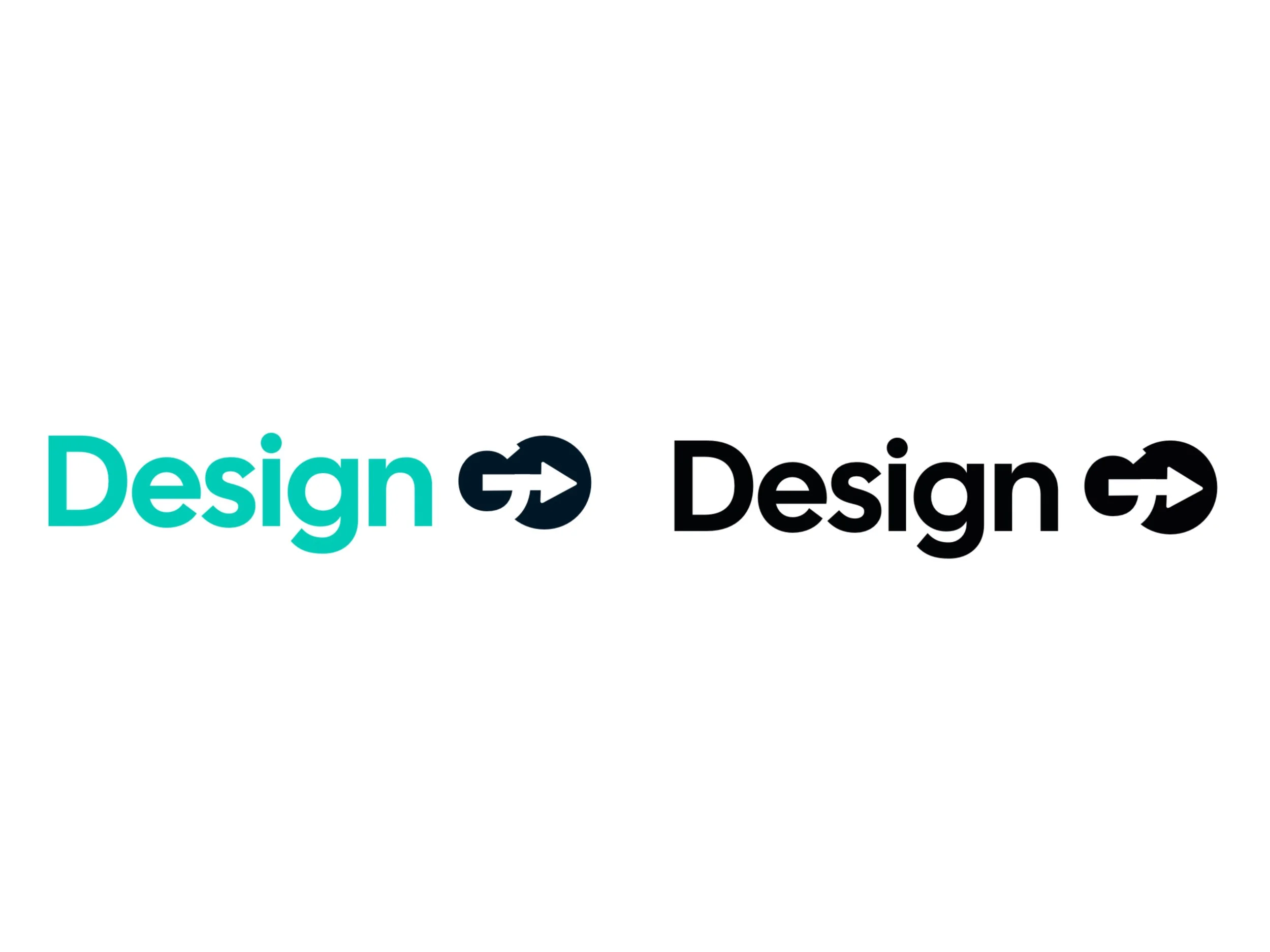
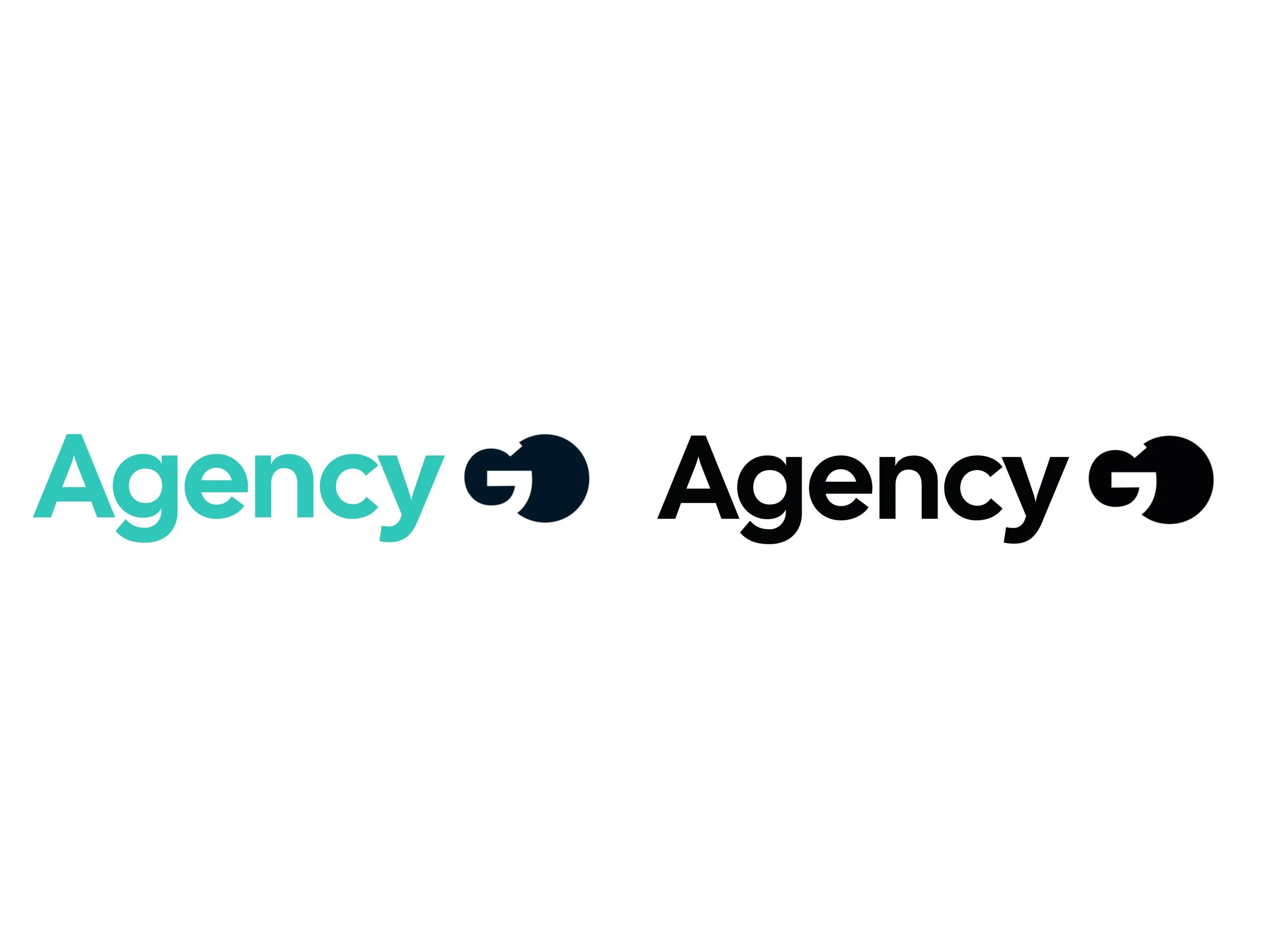
This is a project I did in my Student Media Agency class. The professor was still looking for a logo for the class, and he tasked each of us to come up with concept logo ideas outside of the class name. For this first set of logos, I called it “DesignGo” to mean that this is a place (or class) where one can go for all design needs. For version one I used negative space for “GO” simply to set the simple logotype apart from any generic use of the phrase. For version two I have an arrow to further strengthen the aspect of “going.” For version three, I have the same concept just with a different first word. I used the word “Agency” instead of “Design.” I think this word captures the class’s function better, as not all of the projects are strictly “design projects.”
Student Media Agency Logos (Set 2)
For this second set of logos, I called it “MediaVie.” Vie is the French word for “life.” My point here is that this class is about all things media; hence it’s almost a life of its own. The first three versions have the “M” and “V” connected as one as logo marks. This further illustrates my point of media “being life.” The fourth version simply has the “M” and “V” as separate marks. I chose these colors for a reason: the orange is warm, accepting, and energetic; the blue is clean, lively, and tranquil; the teal is fresh, creative, and imaginative; and the deep blue (almost black) is elegant and modern.
Studio 460 Logos
This was the first of the logo concept projects I did in my Student Media Agency class (commonly known as Comm. 460). My professor had been looking for a new name and logo, and he tasked each of us to come up with concept logo ideas using the name of the class: Student Media Agency/Comm. 460. I decided to change it up a bit and use studio, instead of the class name, as it I thought it represented the class better. I experimented with color, negative space, super-imposition, and shape.
Kingsport Art Guild Logos
These are two of a few logo concepts I worked on for the Kingsport Art Guild while I was a Junior in college. They were looking to update their old logo, which was simply their name without any logomark. Their objective was something creative and modern, yet sophisticated; youthful, yet elegant; simple, yet fresh. They were indecisive with the concepts, and the project just died off.


