Medical Rack Cards
These cards are just a few of the many that I did for my recent internship with Ribbons Physical Therapy, LLC in Johnson City, Tennessee. This was quite the experience for me to be able to work with other people outside of school. I learned a lot.
Album Cover Redesign
This was another recent project from my Digital Illustration II class. The task here was to redesign an album cover for one of our favorite albums. I did Davido’s Timeless album. The original is not bad, but I don’t think it captures the essence of the music quite well–nostalgic. The original is, in my opinion, a little too busy, and the hourglass being straight up (instead of on its side, like mine is) doesn’t really say “timeless.”
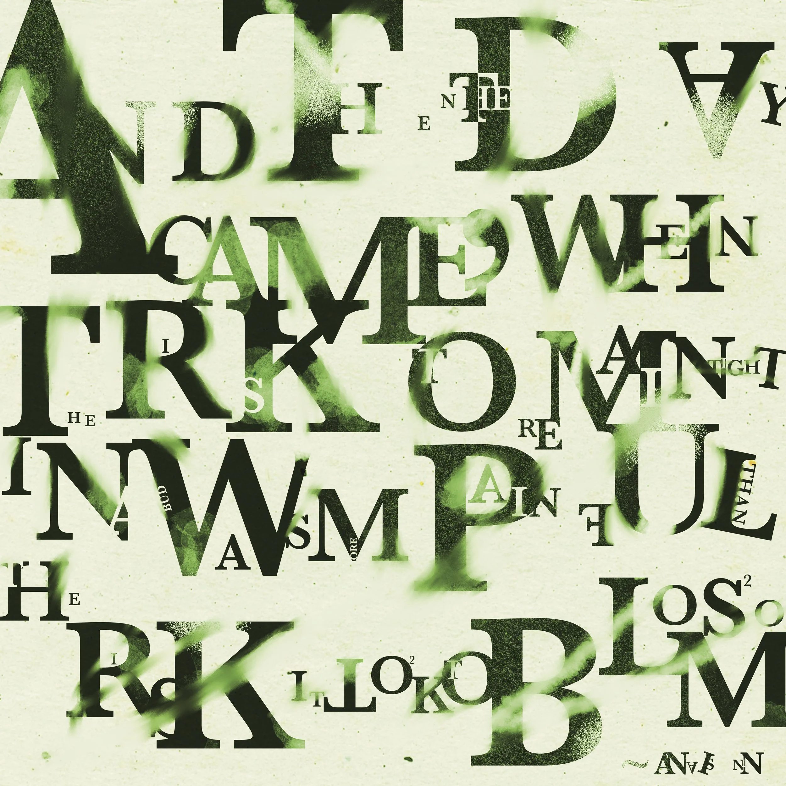
Typography Composition
This project was from my senior class show at my university. My professor tasked each of us to come up with a somewhat abstract art piece using type. Together they worked as one. I chose to do this great quote by Anais Nin, as it captured well how my last semester of college was going.
The Phoenix
This project was from Student Media Agency (Spring 2023), where we take on actual client work. The whole class came up with concept for a cover for The Phoenix, Milligan University’s annual student publication. My idea was chosen by the editor. The theme for that year was “Memory.”
Sometimes our memories get jumbled up and piled on top of other memories. This can obscure some memories, or even fabricate completely new "memories." Memories are simply not all clean cut the farther back you go. With all this in mind, I chose to interpret memory as something intricate, messy even, but with a certain beauty to it. I placed type all close together and with some overlap. I also used a square and blur to separate the center (recent memories) from the edges (old memories). This is to show how recency equates to clarity, and vice versa. Color contrast and inversion also play a part in further strengthening my interpretation: the center is only black and white, while the edges are a superimposition of colors.
Dust Jacket Re-design
This is probably one of my top three assignments I have ever done in school. This project was from Advanced Graphic Design (Fall 2022), and I had to redesign the dust jacket for a book on the “banned books list.” I had lots of fun interpreting what the title of the book means to me. I have the roots coming out of the boy’s feet so signify how hate is something we acquire from childhood and grow up with. The hate intensifies as we grow, which is shown by the red around his head and shoulders. I further illustrate my point with the arrows coming out of the title to show how hate comes from, and goes in, all sorts of places in life. Shortening the original title to THUG on the spine also plays a strong part in solidifying my point–how hate labels people. This book is a must read, if I say so.
Beauty Quote
This project was a group effort from Advanced Graphic Design. We were putting together the quote "The desire for beauty is something that's in us, and it's not trivial" by Stefan Seigmeister. I had fun working with physical materials outside of the computer lab. I was trying to mimic masking in digital software, such as Photoshop. I achieved this result by tracing the letters and cutting them out on cardboard. I then glued the leaves onto the cardboard and cut them out to fit the outline of each letter. I tried to avoid digital means in accomplishing this assignment, as beauty to me first comes from the natural world. I love finding non-digital solutions to design challenges sometimes.
UP & Away
This project was from Publication Design (Spring 2021). For this project I had to come up with a name for a music festival and a design to go with it.
Titan Ad Campaign
This project was from Publication Design (Spring 2021). For this project I had to come up with ads for campaign to move to another planet or moon. I chose Titan, the moon of Saturn, because it seems to resemble earth a lot with its vast plains and canyonlands. It also has nitrogen, like earth, and there’s evidence of a subsurface liquid ocean.
Zephyr Magazine
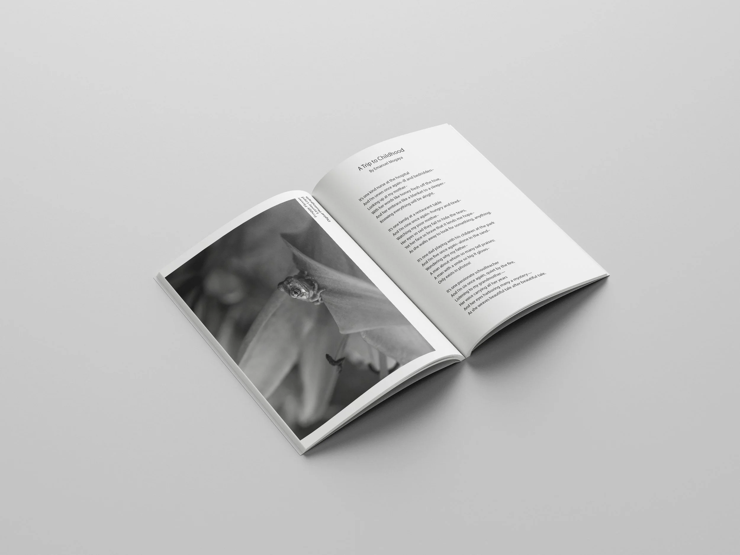
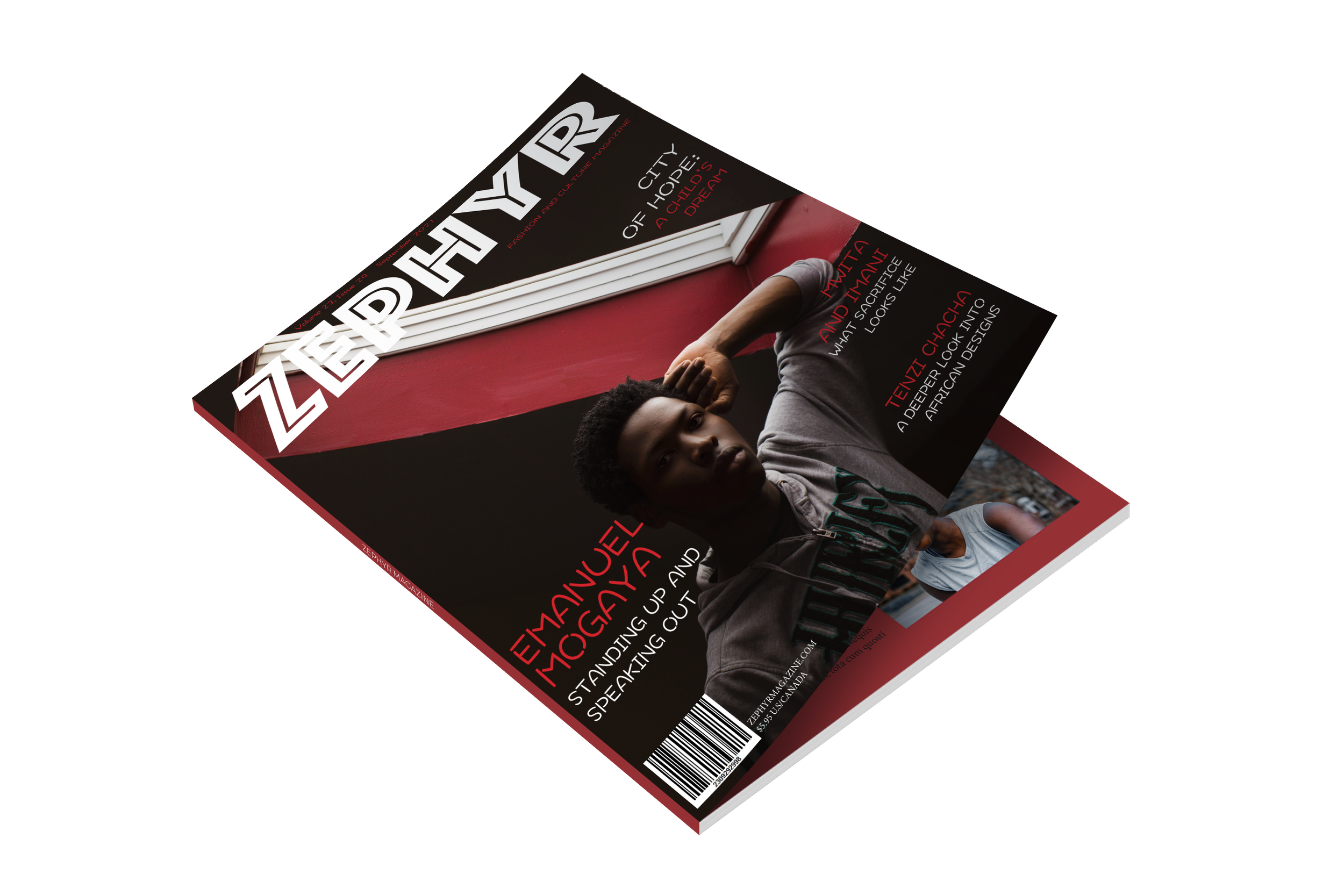
This project was from Publication Design (Spring 2021). For this project I had to come up with a name for a magazine, design the cover, and do the layout design on the inside. I was still new to graphic design. It was a bit of a learning curve, but it was definitely fun. I used a self-portrait for the cover, and a few of my other photos of other people on the inside.


